Reports
You can turn any Favorites dashboard into an email report containing a week-over-week comparison of your data. Reports are sent out automatically to your mailing list every Monday.
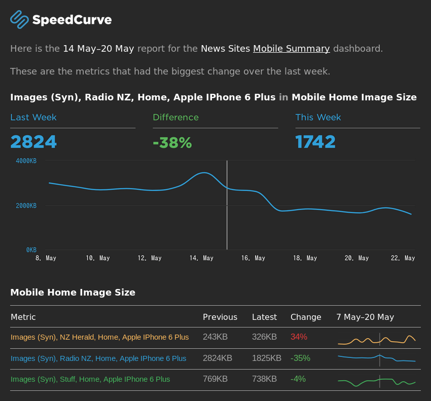
Each report will look something like this:

Enabling weekly reports for a dashboard
You can enable weekly reports for existing dashboards by clicking on the cog icon at the top-right of the dashboard. Then tick the Send this dashboard as a weekly email report checkbox.
Note that by default, the Email Recipients field will be filled with the emails from your Notifications settings.
You can also enable weekly reports for new dashboards in the Add Dashboard dialog.
When are the reports sent out?
Reports are sent every Monday around 9:00am in your SpeedCurve account time zone.
Can I change what time the report is sent?
No, right now reports are sent automatically at 9:00am on Monday.
Can I preview a report before it is sent?
Yes, you can view a preview of the report by clicking the (view email preview) link in the dashboard settings.
How do I unsubscribe from a report?
To unsubscribe, you must remove your email address from the Email Recipients field in the dashboard settings.
Why haven't I received my report?
Check your spam folder and your corporate firewall. If the emails continue to be marked as spam, you can whitelist [email protected].
What exactly will be in the report?
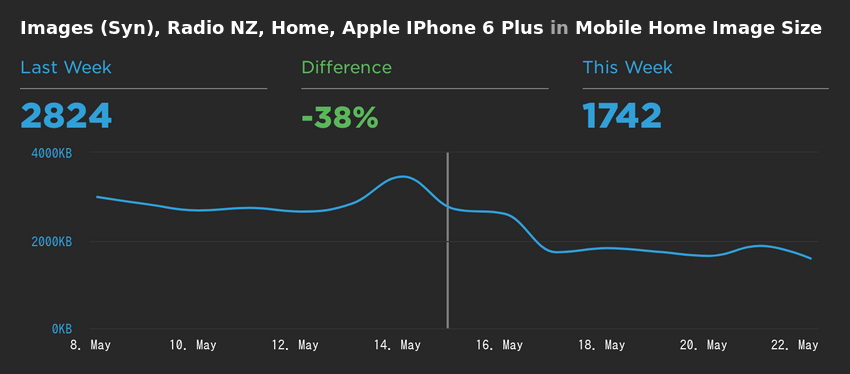
The top of the report shows two detailed charts for the metrics that had the biggest rate of change in either direction. That is the metric that increased the most, and the metric that decreased the most. These charts will look something like this:

Note that if there was no change to any metrics in the last week, these charts will be omitted.
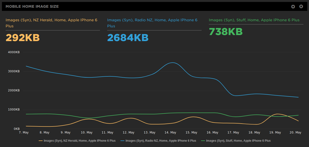
The main part of the report will contain one section for each chart in the dashboard. Each section contains a table with one row for every metric in the chart. For example this with 3 metrics:

Will be displayed as a table with 3 rows:

Each row contains:
- The metric name
- The median value of that metric for the previous week
- The median value of that metric for this week
- The difference between those two median values
- A sparkline showing the data for the last two weeks
Updated 6 months ago